ShopDreamUp AI ArtDreamUp

Deviation Actions
Early Access and Process
This Tier will get you early access to my work as well as my work in progress / art process.
$5/month


Suggested Deviants


Suggested Collections


You Might Like…


Description
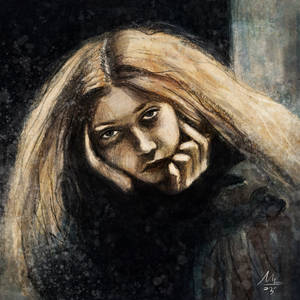
This is another Cover idea i had for fluffy facade
Image size
970x2099px 2.32 MB
© 2012 - 2024 Dallinology
Comments4
Join the community to add your comment. Already a deviant? Log In
I love the hints of blue that make the sheep appear larger than life and somewhat ethereal. I almost wish the butcher was doing something more gruesome, though with the knife there is decent potential, maybe he should be washing it and have a really bloody apron, because he's been wiping the blade and his hands on it all day. The sheep looks sort of -too- innocent but its size alone is unnerving. The words "fresh meat" almost don't read because the E and S look similar, and H and the M look similar, the "A" is nearly illegible in the corner. Legibility aside, the integration of the letters works, you might just try laying them out separately when you use this style because they like to mush up in random places. I would say you have the right idea, stylistically: I love your line quality! It is both expressive and intentional, two qualities that can be hard to mesh seamlessly but you have a knack for it. On the second look, I notice some drippy looking red shapes in the top corners, which I assume to be either meat or blood. they are maybe too ambiguous, but I like gorey so that could just be subjective. I want the sheep to cast a shadow, it seems unreal or like an apparition. I see a suggestion of shadow at his hooves but it might really add to the depth/composition to make that area VERY dark, nearly black or similar to that wonderful bruisey mottled color next to the bright blue on sheeps' chest. This will probably make your lettering look more cohesive too, because it is currently the darkest thing on the page and therefore commands the most attention. There should probably be a little tone under and around the table or counter in front of the butcher, to make it read as solid. The white area is a little distracting in a way that makes me wonder what's going on, is it a counter with cabinets? A cutting table?